Case Study: Responsive Mobile Web Site
Client: Rapaflo
Agency: Havas Worldwide
A mobile web site was designed to match the offering of content on the desktop product site with a focus of providing easy access to CRM functions. It is the organization's first responsive site aimed for smartphone users, with the layout reflowing between portrait and landscape orientations for content viewing optimization.
(click images below to view large)
|
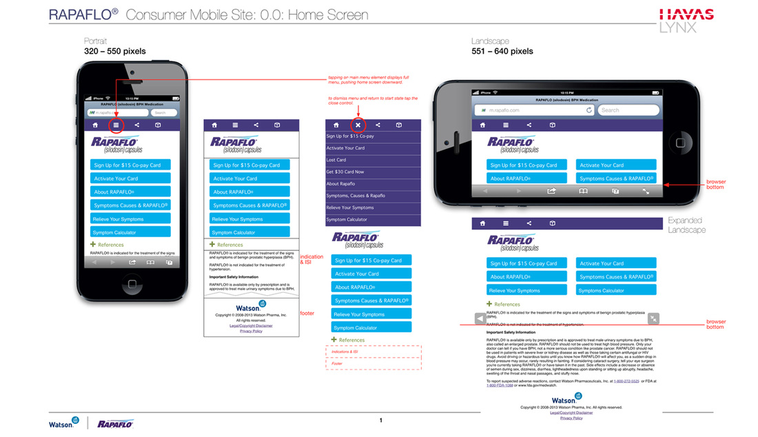
Home Screen and Main Navigation
|
In a departure from the product web site the responsive mobile web version brings the major CTAs up and center. All of the major product information and legally required content are also easily accessed both on the home screen and the drop down main navigation.
Also easily accessed through out the experience is the ability to share a link to the mobile site and apply for home delivery of the product. |
|
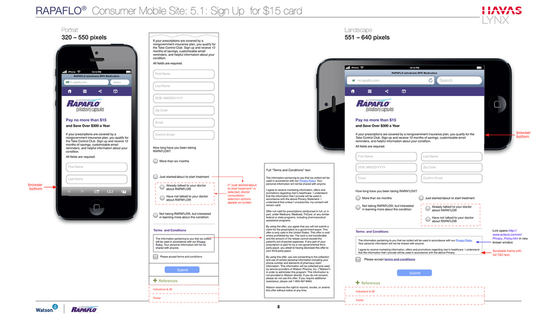
Streamlined Customer Loyalty Building Functions
|
To give the experience maximum value on a mobile device all CRM functions are streamlined in the UX while still allowing for capturing all required data to build customer loyalty.
Functions in the mobile experience include: • a symptoms and relief tracking tool; • signups for product discount cards; and • activation tools for doctor-issued discounts. |

